Designing Our Kitchen: Part 1
Where does our inspiration come from? That’s a question we, along with so many designers, get all the time. In most cases, the answer isn’t always as simple as one would hope. Designers are constantly recalling places they’ve been, moments they’ve seen, and images they’ve loved. It can be the tiniest element in a photo that inspires you or the overall spirit of a place you want to evoke. It can also be your surroundings - so often our biggest inspiration comes from the house we are renovating.
“To kick off our kitchen design series, we want to start at the very beginning.”
We’re giving you a glimpse into our design process and how we find our inspiration. Before starting any project, we ask ourselves what is our overall intention? Is there a particular style we are wanting to explore? What will make our space unique from other spaces? What problems are we trying to solve? Are there certain elements we want to feature?
Defining the Style
It’s a little challenging to distill our inspiration images down to a select few. We’ve been pinning images for this kitchen for over 2 years now and it’s interesting to see how our vision of the space has changed over time. Generally, our process goes like this: Rachel pins and saves a big pile of images, she then reviews them with Owen and he picks his favorites, next we copy those over to a slide deck and start to find common themes. What details are standing out to us? Are there specific shapes, materials or features that keep showing up?
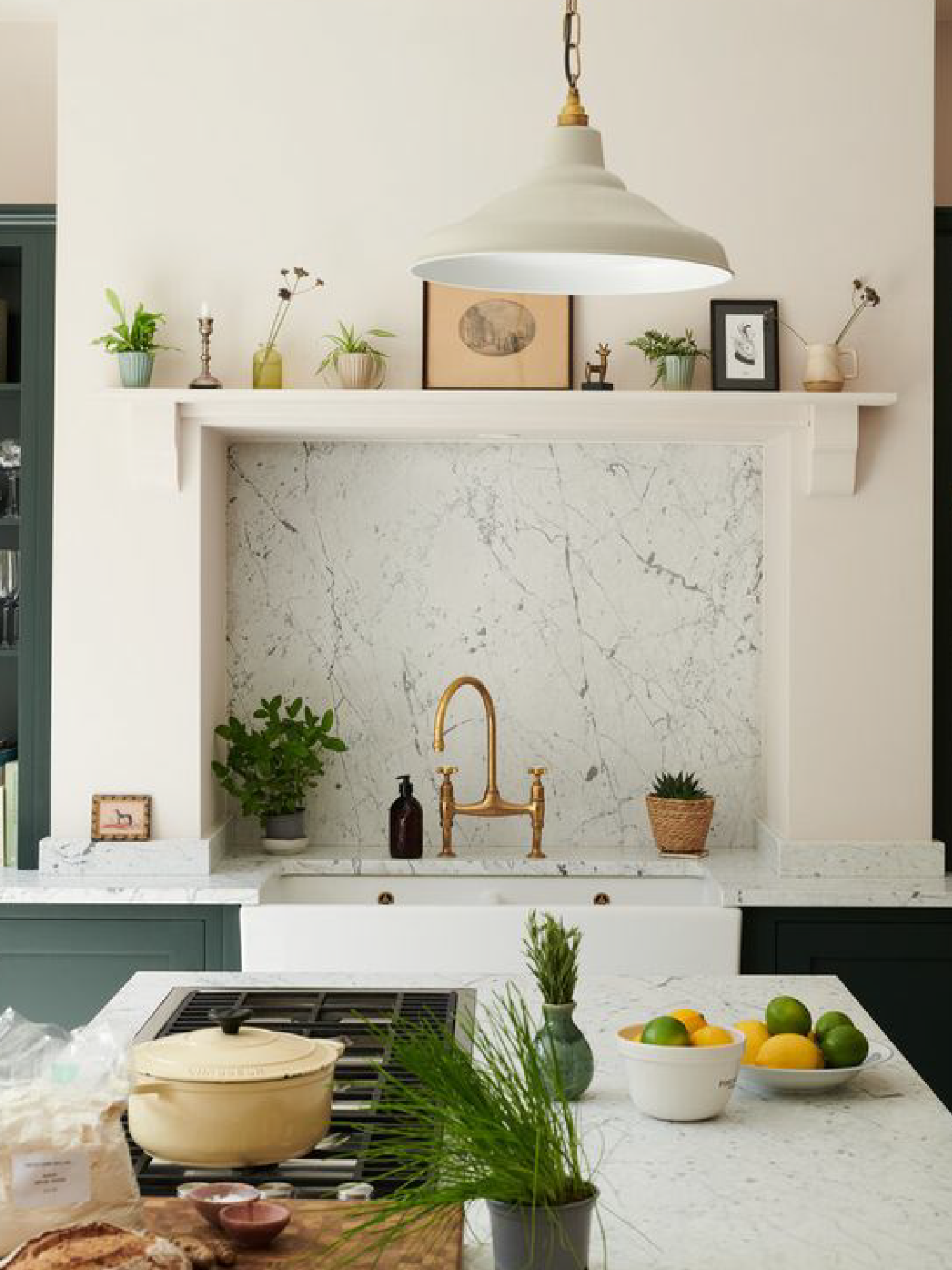
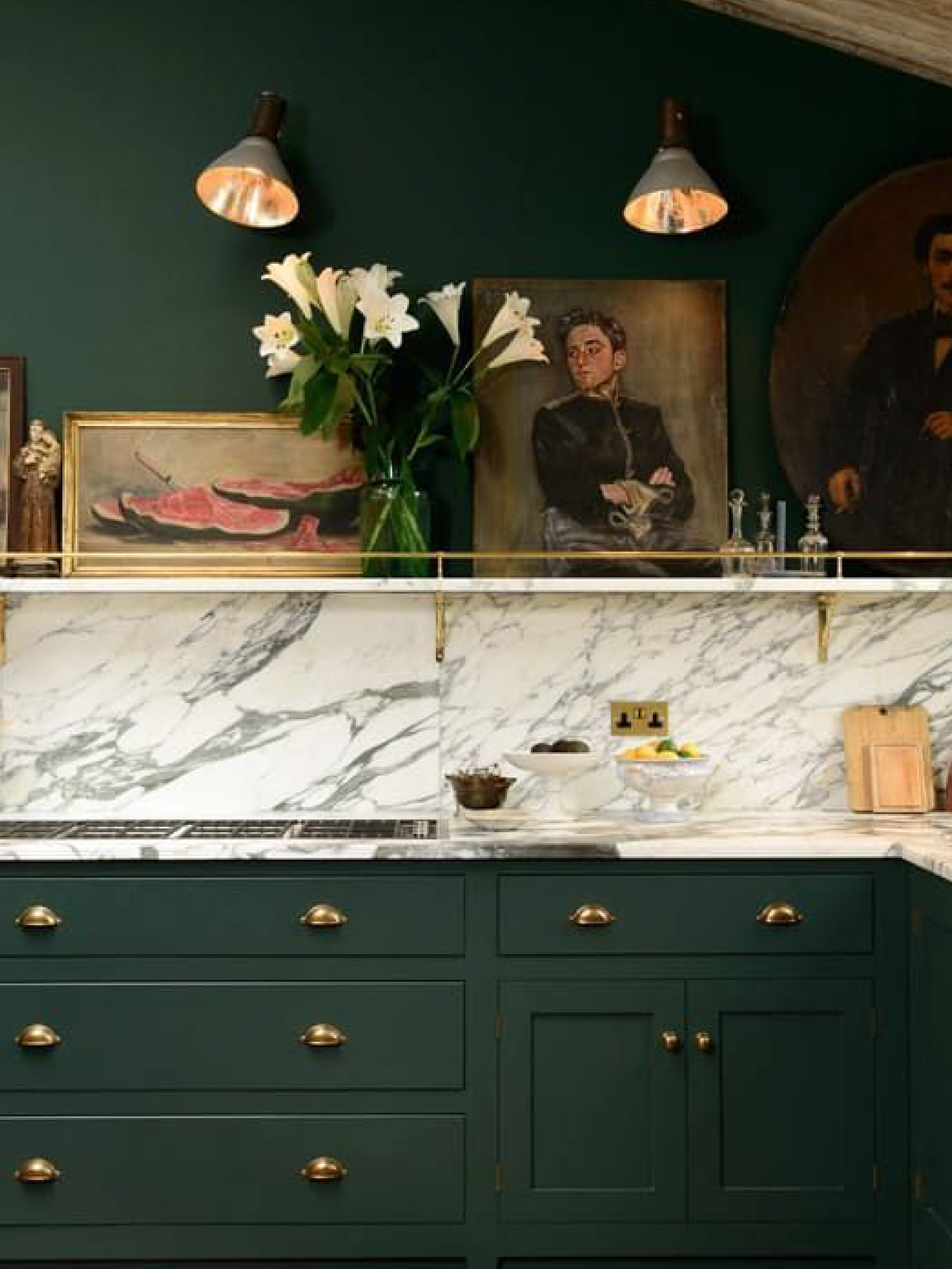
In the case of the kitchen, it was clear we had a specific style in mind. As you can see, the images we were drawn to have a very English, almost Edwardian, feel. Beyond us liking these images stylistically, we also felt this style of kitchen would be appropriate to the era and style of our house.
Common Elements
We noticed a few common threads that kept showing up in some of our favorites. Let’s go through them.
Minimizing the Appliances
The first thing you’ll see is how appliances play such a small role in the kitchen. Hiding the appliances was a big goal of ours. With a more historically inspired kitchen, we wanted the modern conveniences of a kitchen today but wanted to fool the eye and hide away the larger appliances. With exception to our range (which will be a bit of a design focus), the other appliances disappear. This means the refrigerator and microwave are relegated to our butler’s pantry and the dishwasher will be a panel-front to blend in.
Let’s Make a Hearth
When you think of a traditional English kitchen, one feature that comes to mind is the classic mantle over the range. Since we removed an existing chimney from the kitchen, we thought it would be a nice nod to add back our own version of a hearth and mantle above the stove. This also conceals a modern hood and adds an extra layer of charm to the space. We are excited about a few additional design details we have up our sleeves to personalize our version of this classic feature. We’ll be sure to share more about those in a future post and on our insta stories.
Handcrafted Hardware
The English country kitchen inspiration continues as we move into thinking about hardware. We knew from the beginning we wanted to include a long feature shelf with patinated brass rods & s-hooks from deVOL. Our lighting is Devol as well and will bring in more of that handcrafted quality we’re looking for.
We also plan to keep it classic for the cabinet hardware with bin pulls, latch locks, and oval brass knobs. We ordered a single latch lock from Rejuvenation to look at as a sample before ordering the whole lot. It’s always hard knowing which route to go with little details. For example, after ordering all of our cabinet hardware, we saw the more modern brass knobs Reserve Home just got for their new kitchen. It obviously made us (aka Rachel) swoon with envy but sometimes you just have to go with your gut. Design FOMO is real. But in this case, we think you can’t go wrong with the classics.
Display Shelves & Setback Cupboards
In the service of our collection of antique ceramics, glassware, and art objects (one of the many benefits of having furniture conservator/antiquarian parents), we looked for ways to incorporate a variety of open shelving types for display. Owen was hesitant at first but Rachel was persistent in her pursuit of incorporating glass-front, cupboard-style setback cabinets into the design. Owen hated the idea of giving up counter space but eventually gave way once we reworked the layout a bit to gain more countertop length.
These display cabinets, combined with some integrated open shelving, the long oak shelves above the sink, and the mantle will give us plenty of opportunity to display stuff that’s been packed away for years. But don’t worry, we will still have a significant amount of closed cabinets to work with given the fairly large kitchen footprint and high ceilings.
As we continue our kitchen design series, we’ll be covering all the topics, from budget & appliances to material selection, lighting, and finalizing our cabinet layout. Be sure to sign up for our newsletter to be the first to know when the next post goes live. Next up: the top 5 ways we plan to make our kitchen unique and personal to us.


