Painting Our Japanese - Inspired Wall Mural
Rachel has been interested in trying out wallpaper for some time, and in particular, is drawn to abstract patterns that can be used as an accent or feature wall, acting as a nice focal point for a space. As we worked on renovating our guest bedroom, we decided that we wanted to add some texture and pattern to help animate the room. The room in question is the same room we featured in an earlier blog post about installing our Nelson light. We added a skylight and vaulted the ceiling framing to culminate in a small square skylight in the center of the room - animating a previously boring room that had only one window.
We painted the vaulted portion of the ceiling white, but incorporated a strong terra-cotta color as a border for the rest of the ceiling - then, as a point of contrast, we chose two different colors for the walls -- a light pink for the side walls, and a white for the window wall and the wall behind the bed. The light beige trim color (doors, window trim and picture molding) ties the room together and nicely complements the warm tones of the walls and ceiling. We could've stopped there, but can't help ourselves.
To Wallpaper, or Not to Wallpaper
For the guest room walls, Rachel initially found a fun wallpaper consisting of a maybe 2” continuous white line on a peachy background that had a very abstract and fun meandering effect - almost like a super-graphic of spaghetti noodles. It was striking to be sure, and certainly would make a statement, but as we thought more about whether or not to go for it, a number of important considerations came up.
First and foremost, we decided that we wanted the pattern to be something original and personal, and a custom statement. Second, though we liked the squiggly line pattern, we were concerned that it might be a little too punchy and ‘of its moment’ (would we still like it in ten years?). Aesthetics aside, we’ve also learned that wallpaper can be pretty darn expensive (around $700 for the amount we needed) - not even factoring in the expense of potentially hiring someone to hang it.
The fact that our old and patched-up plaster walls are not very flat was another important consideration - wallpaper is harder to install successfully on uneven surfaces. While we’re ordinarily quite gung-ho about DIY and probably would have hung it ourselves in the end, somehow hanging wallpaper seemed like it could be real easy to goof up, and would just end up as an expensive and messy kindergarten craft project.
“In light of all the considerations mentioned above, we determined that painting in place our own customized pattern would ultimately be a better approach”
While it definitely took more time, it was much more cost effective, and also turned out to be a lot of fun. Rachel’s longtime friends Bryan and Alex of House of Misters are experts at doing custom murals like this one, and had recently explained the process to us. Given their success, we were inspired to try out a similar approach to our wall painting. Using a relatively inexpensive digital projector and a specialized paint pen, it’s actually quite easy to project and trace a large-scale mural.
Finding Our Pattern
After deciding to paint our own custom pattern instead of purchasing wallpaper, the next big problem was deciding what kind of pattern to paint. We really love the subtlety and balance between geometric and organic forms shown in Japanese woodblock print patterns. Mountains and wave forms have been used as motifs in Japanese decorative arts for hundreds of years. At first, we sketched out a pattern quite similar to the Japanese ‘seigaiha’ wave pattern. Ultimately, we decided that the geometric purity of the repetitive arcs we were drawing felt a bit stiff and formal - almost too ‘art deco’ in their execution.
After continued reference imagery searching, we came up with a suitable precedent image that struck a good balance for us. This wallpaper product, offered by MissPrint was good inspiration, and although an entirely different color range and pattern scale than we wanted, it did have the right balance between geometric and organic form to its pattern. The traditional Japanese seigaiha pattern was too formal and the original ‘spaghetti noodle’ wallpaper was too ‘fun,’ but it seemed like these abstract mountain forms, rendered in thousands of small vertical strokes, would have the subtlety and sophistication that what we were looking for when applied in white over the base field of light pink.
15,000 Lines Later
How did we do it? After producing our own interpretation of this classic pattern using Adobe illustrator, we set up an artboard with the same proportions as our guest room walls. Then, realizing that our projector didn't have the lens width to do the whole room, we subdivided the illustrator artboard into four quadrants, loading one quadrant to the projector at a time. We included match lines on the image, and then marked off the quadrants on the wall with tape. Setting up the projector was difficult because it had to be at roughly the exact same distance from the wall and exact same distance from the edges of each quadrant every time (to get the elevation needed for the upper quadrants, we had to perilously balance our projector on top of a home-made tower comprised of sawhorses, a box, and a tall stool all taped together for stability).
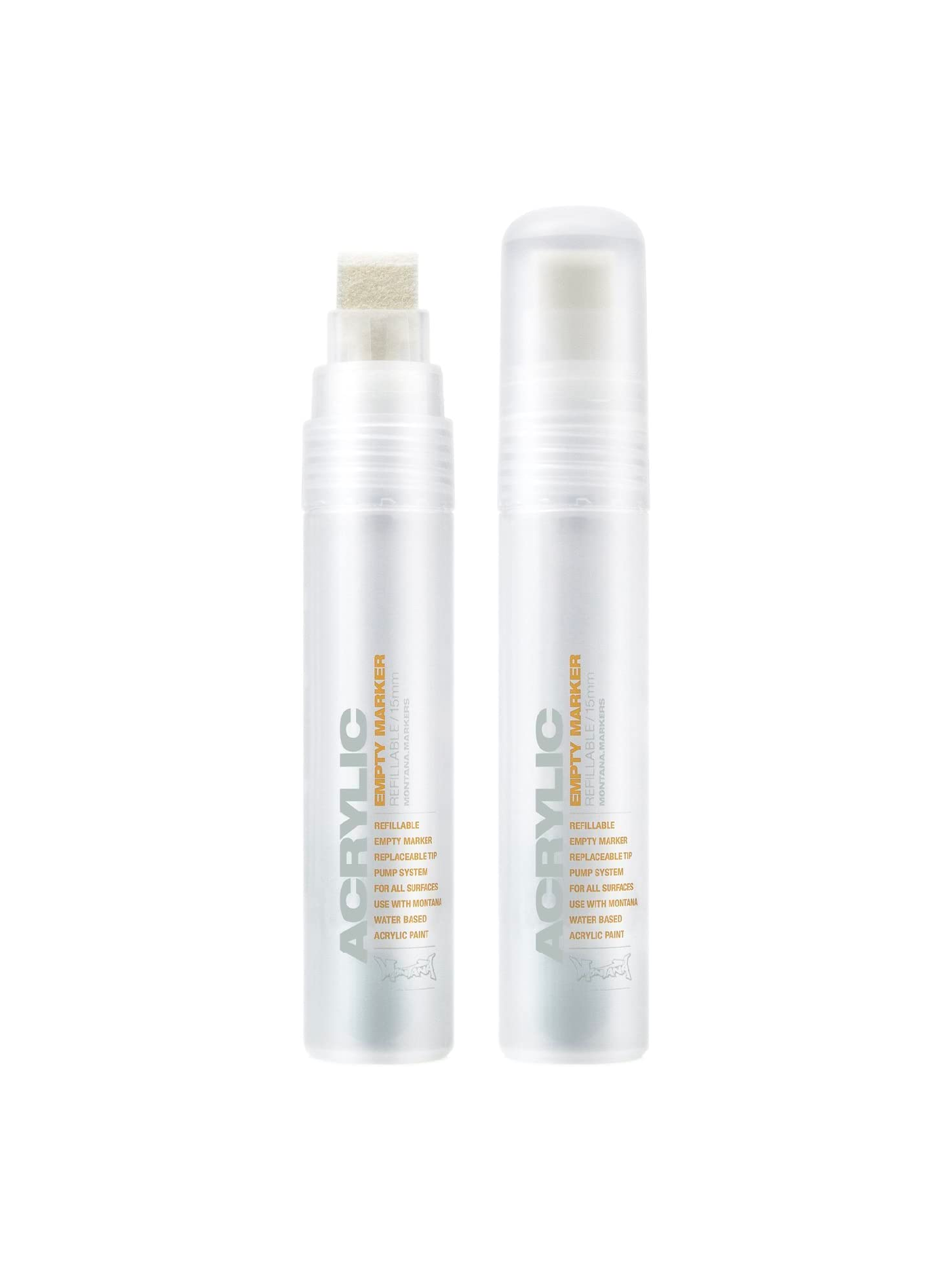
The next step was all Rachel. Up on the rolling scaffold or crouched in the corner, she meticulously hand-traced the thousands of lines using her Montana refillable paint pen. She spread out the task over a couple of weekends in order to maintain sanity (we estimate it’s maybe 15,000 lines), but it actually didn't take as long as you might think --- about 12hrs total.


