Dreaming Back to Dreamers Welcome
Several months ago - you know, back when we could travel - Owen and I took a trip to Wilmington, North Carolina for a little Howlett & Co visioning retreat. If you all ever get the chance to go to Wilmington for a long weekend, we definitely recommend it. We went in March (we literally returned from our trip and 2 days later went into quarantine) and the weather was lovely. The town is quaint and has some adorable spots. We especially enjoyed Threve Mercantile and Bespoke Coffee. I mean, look at this floor tile + shadow play combo...
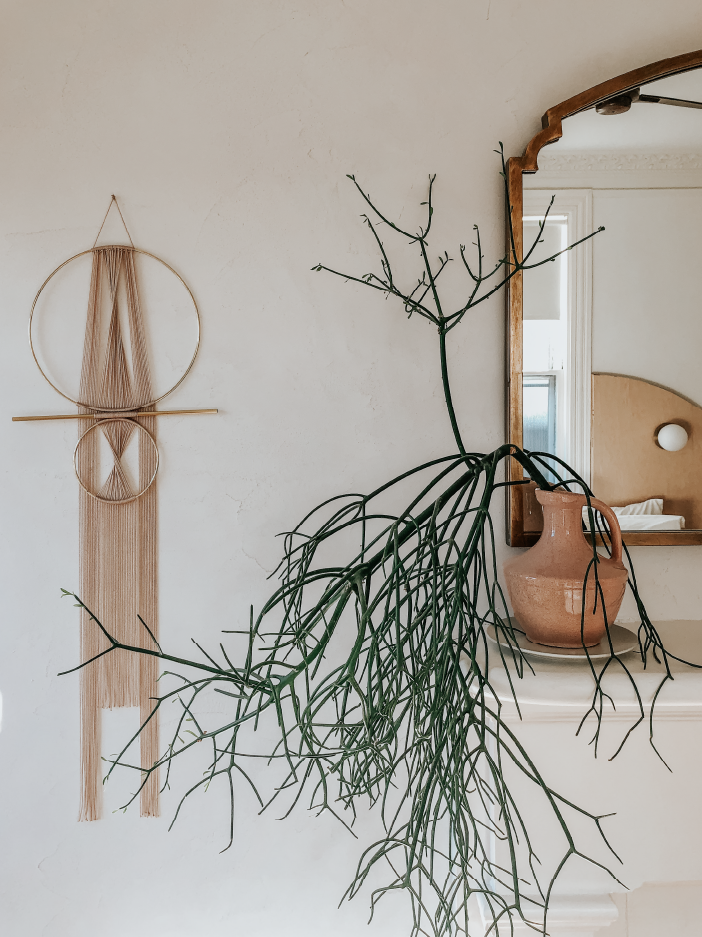
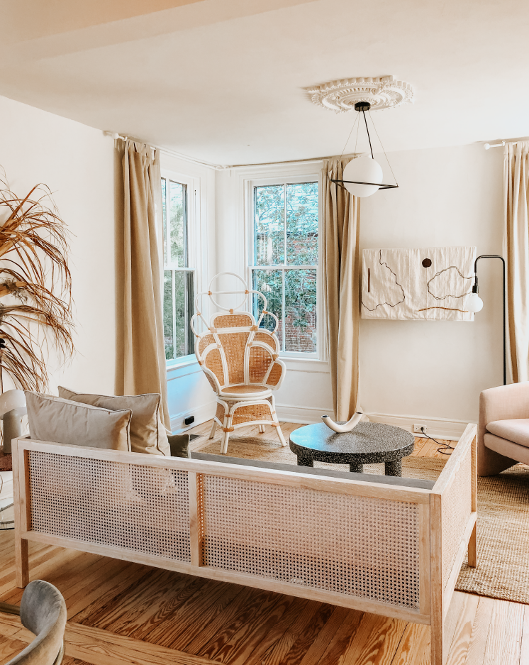
The big takeaway from this trip however was not the shops we saw, but the place we stayed. We specifically chose Wilmington as a getaway because of a newly opened boutique inn I had been eyeing as design inspo. I did my fair share of mild instagram stalking and was curious to see it for myself. Today we are dreaming back to the Dreamers Welcome hotel and want to show you all our favorite design moments as well as a few details Owen and I saw that may get reinterpreted into the Howlett & Co house.
Blending Old + New
One of the reasons we were so drawn to the Dreamers Welcome was how well it blended current design aesthetic with an appreciation for the intrinsic characteristics of the historic Queen Anne shingle style house. We loved that there was not a polarization of contemporary versus traditional. Their approach to design was not to mix and match. It clearly had a set of rules that highlighted architectural details. It kept the beautiful, historic structure as a shell and let everything else within it be contemporary but generally respectful..
To give you a bit of background, this boutique hotel opened in the summer of 2019 and is within a stone’s throw of Wilmington’s downtown. As a 130 year-old extra-large family home, repurposed into an inn, this project is largely sympathetic with the character of the house but does things in a completely fresh and new way.
“It mixes playful color palettes, affordable materials such as plywood and ceramic tile, and budget-friendly furniture with select designer pieces and austere architecture. ”
Preserving the Historic Character
Since we often tend to take personal projects in a more historic direction, we’d like to note that this project is not historic preservation. Nor should it be. Some spaces were reconfigured, certain elements were kept or restored, others were completely redone. From Owen’s point of view, it was slightly more invasive than what he would normally have done but we recognize that this is an adaptive reuse of a really large old house. How many people would really be interested in doing a full historic renovation of a house that scale? It’s not practical, especially for a business. All this to say, we were above and beyond impressed with the beautiful spaces the owners created and loved the entrepreneurial spirit of the project.
Our Favorite Design Moments
So let’s dive into some of our favorite design moments in the house. There were so many but we’ve narrowed it down to a top 4. Scroll down to see the highlights.
The Gardens
The garden design had such a cool, subtropical feel (which paired quite well with the slightly 80’s tropical vibe on the interior). It was nicely zoned, with pockets of private versus shared. That’s often one thing missing from a lot of garden layouts. It also had more intrigue and variety compared to a space this size might typically have. All around, many thumbs up.
The Porch
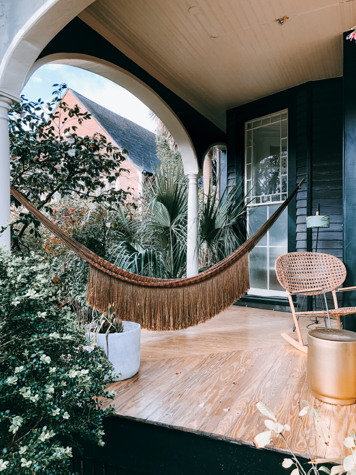
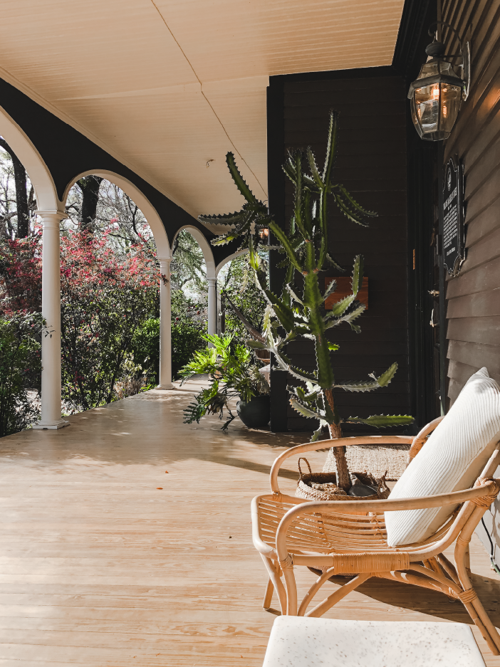
The owners clearly identified which attributes of this house were really enjoyable and needed to shine. One of the first ones you see is the front porch. It proudly extends the full width of the house and is furnished to feel both welcoming and chic. We spent LOTS of time on this porch in our short two night stay.
The Dreamer Suite
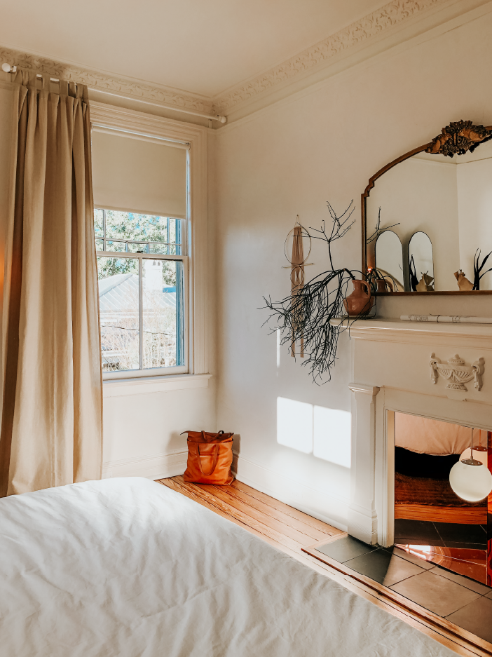
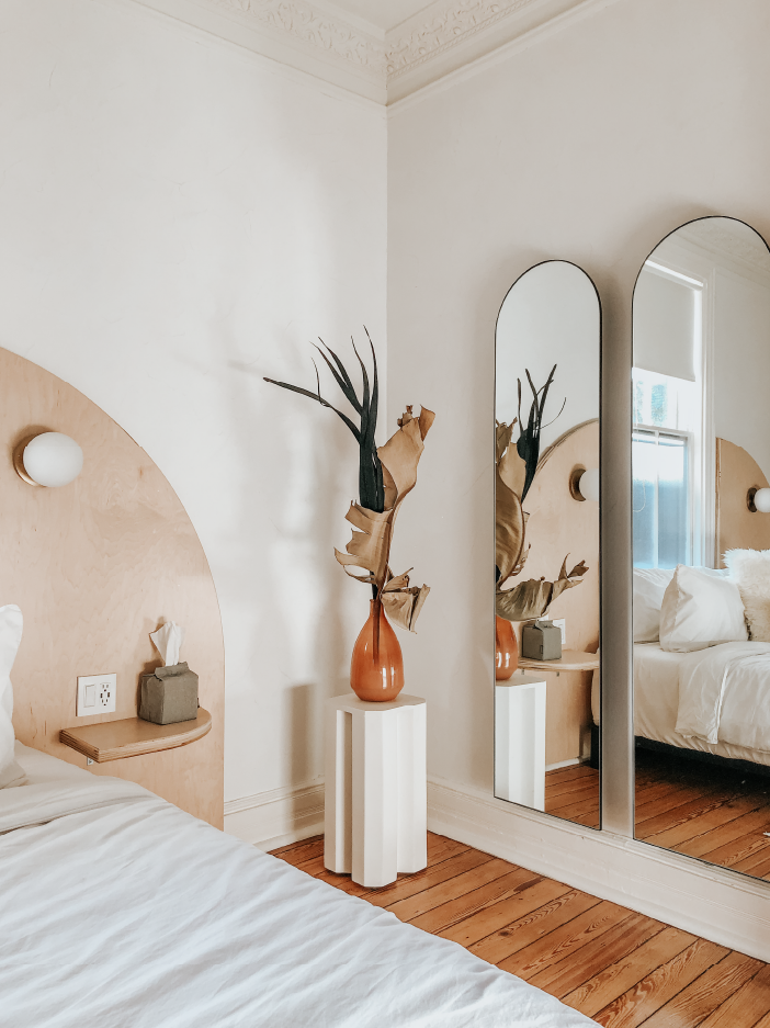
Where do we begin. There are so many things to love. This suite had its own private garden entrance and had everything you could need. The sun-filled living space had the most perfect daybed sofa and wonderful garden views. Just check out the photos for yourself. From the double arch mirrors to the custom headboard and the fanciful fireplace insert, we could have stayed here forever. Seriously.. Can we go back?
The Little Details
Last but not least, the attention to detail is what really took this place over the top. The custom brand moments, the blue-print style city map, and the dreamy dried floral arrangements remind you that this little inn was not messing around. Our favorite detail, however, was not something visual but rather the curated Dreamers Welcome Radio you could stream throughout the suite. It’s a cool blend of instrumentals, St. Vincent, Ratatat, Elvis, and more, all with little southeast asian flare thrown in. Lucky for you, it’s available on Spotify so you can listen for yourself. We listen to it all the time, even now.
We’ve Been Inspired
Although drastically different in scale, the house at Dreamers Welcome shares several common elements with our house in Richmond. From the floor-to-ceiling windows and elliptical arches to the fact that they are more or less the same age, it was easy to envision many of the same design moves working well at our place. To wrap up, we thought we’d share a few little design features we were so inspired by that we plan to reinterpret them into our own house.
First up, let’s talk about this peach ceiling. The parlour at Dreamers Welcome (along with the Dreamers Suite bathroom) was painted out in this great dusty rose ceiling color and we plan to do the same in our dining room. Hopefully that will come to fruition later this year.
Ceiling Paint Sherwin Williams Peach Fuzz SW6344 | Pendant Light Harto Carmen Pendant, 120cm | Floor Planter West Elm Fluted Planter
“Continuing the color theme, we love the combination in this room of these mustard curtains with bedside pendants suspended from the above. ”
This approach to lighting also shows up in The Line in DC, one of our other favorite design hotels. I used to stay there a fair amount when traveling for work and have been wanting to find a place to hang lights the same way in our place. As you can see, our guest bed is getting the full treatment. This should be done and installed in only a matter of weeks! Feel free to shop to links below to see where we landed with our selections.
Curtains Anthropologie Mara Curtains: $64.95 | Light Fixtures Schoolhouse Electric Apartment Plug-in Pendant & Metal Dish Shade: $218 | Area Rug Handknotted.com Braided Jute Rug: $369 | Nightstands HAY Bella Side Tables: $250.75
Lastly, there are a few other details, from this creative solution to hiding a tv as well as the way they integrated a rain shower with the clawfoot tub that we also plan to implement.
Needless to say, this 2-night trip to Wilmington sure gave us some great design inspiration and we hope this post inspires you too! We’re always on the lookout for projects that blend historic with contemporary in a new and fresh way. Head on over to our insta if you want to peek more of our pics from the trip!
